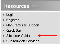
While on the Online Store website for a highly recognizable brand name, I noticed the following box:

I assumed that Site User Guide would be a link to an online help environment, a series of tool tips or FAQs, or -- at worst -- a Flash-animated tutorial on how to use the site to make online purchases.
Instead, Site User Guide actually links to a 38-page downloadable .pdf document, covering everything from how to login to what the site's privacy policy entails.
My favorite part is found under the section "Navigating the Site":
You will find site navigation simple and intuitive. To move from field to field, use either the Tab key or point and click with your mouse. To go to different site features, point and click on the menu item. To return to a previously viewed screen, press the “back” button on the browser toolbar.
This company's bread and butter is consumer electronics, so I can understand the probable emphasis on printable user guides within the corporate culture. But I never thought I'd see the day when a "simple and intuitive" website would require a set of printed instructions.
No comments:
Post a Comment